Helping Hands

In 2025, a range of issues impacted communities across the UK. In response, I collaborated with three other designers to form a collective focused on raising awareness and educating audiences. My contribution, Helping Hands, highlights individuals supporting their communities, aiming to inspire others to take action.

Our collective, Orchestra, was formed to make noise unapologetically, amplifying unheard voices and initiating conversations around topics often avoided. In this issue, we explored graffiti, Union Jacks, and bin strikes, all subjects that were creating tension within communities across Birmingham. Helping Hands combines interviews and imagery from youth development charity workers and individuals supporting environmental initiatives, presenting community-led action as a response to these wider issues.
Helping Hands combines interviews and imagery from youth development charity workers and individuals supporting environmental initiatives, presenting community-led action as a response to these wider issues.


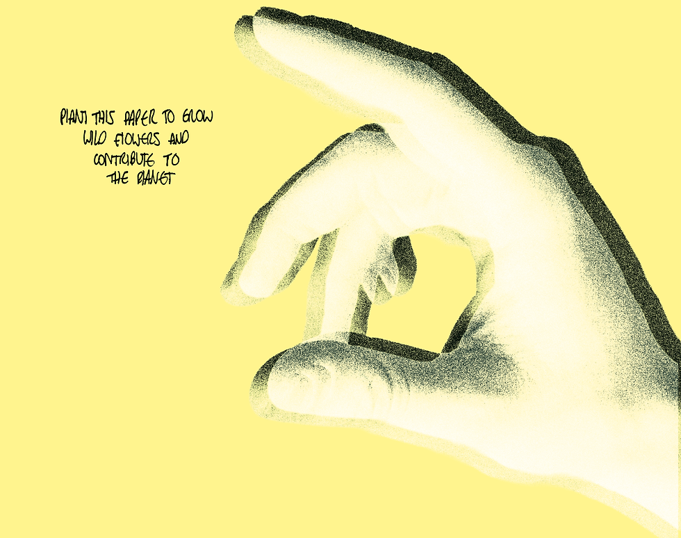
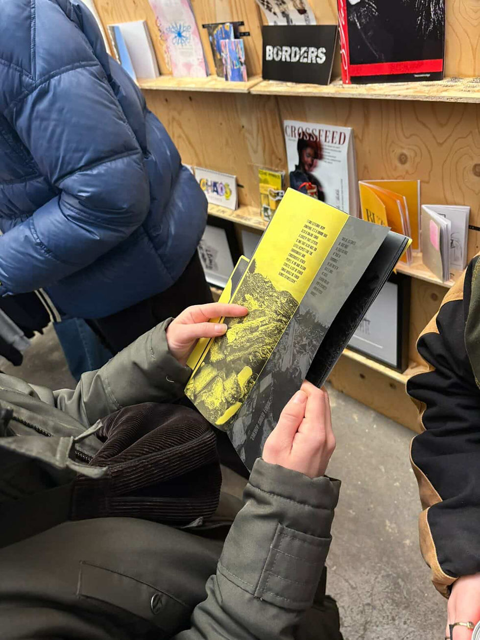
Positioned at the centre of the publication, Helping Hands uses a bold yellow to create a moment of contrast and pause. This shift in tone offers relief between heavier topics, helping maintain engagement and increasing receptiveness to the more challenging content. A variety of handwritten type is used to create a sense of intimacy and involvement, encouraging the viewer to feel both heard and included. This familiarity softens the tone and improves accessibility. Although I began the project with a single custom typeface, incorporating multiple handwriting styles became a deliberate choice to represent shared voices.
Positioned at the centre of the publication, Helping Hands uses a bold yellow to create a moment of contrast and pause. This shift in tone offers relief between heavier topics, helping maintain engagement and increasing receptiveness to the more challenging content.
A variety of handwritten type is used to create a sense of intimacy and involvement, encouraging the viewer to feel both heard and included. This familiarity softens the tone and improves accessibility. Although I began the project with a single custom typeface, incorporating multiple handwriting styles became a deliberate choice to represent shared voices.
Raw imagery is used throughout, with hands acting as a visual motif for connection. While the editing approach mirrors the wider publication to maintain consistency, it is intentionally minimal, in order to preserve authenticity and reinforcing a sense of relatability.
The centre spread is printed on seeded paper, turning the publication into a physical call to action. By planting it, the viewer becomes part of the change. The tactile quality, developed through trial and error, echoes the textured visual language of the wider publication.