The
Letter Tree

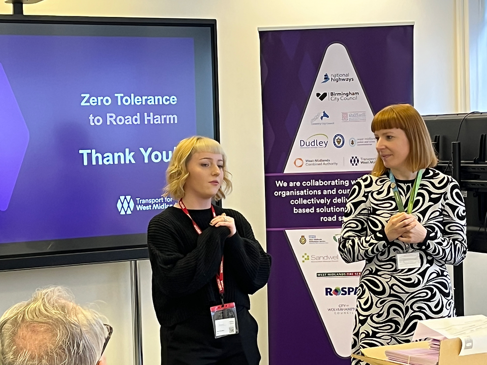
Transport for West Midlands (TFWM) launched the Zero Tolerance to Road Harm campaign in late November 2025. Families of road crash victims were at the forefront of the campaign, writing letters to their loved ones, or the accused, to raise awareness about road harm. I was approached to design a book that brought all the letters together, whilst respecting individuality. The book is a memento of thanks, to mark the importance of their contribution to the campaign.
Working alongside the TFWM team and families, I designed a book that showcases the campaigns Letter Tree with a respectful space for each letter and poem. I put thought into tone, type, illustration and layout, focusing on giving each person a meaningful spread within the publication.


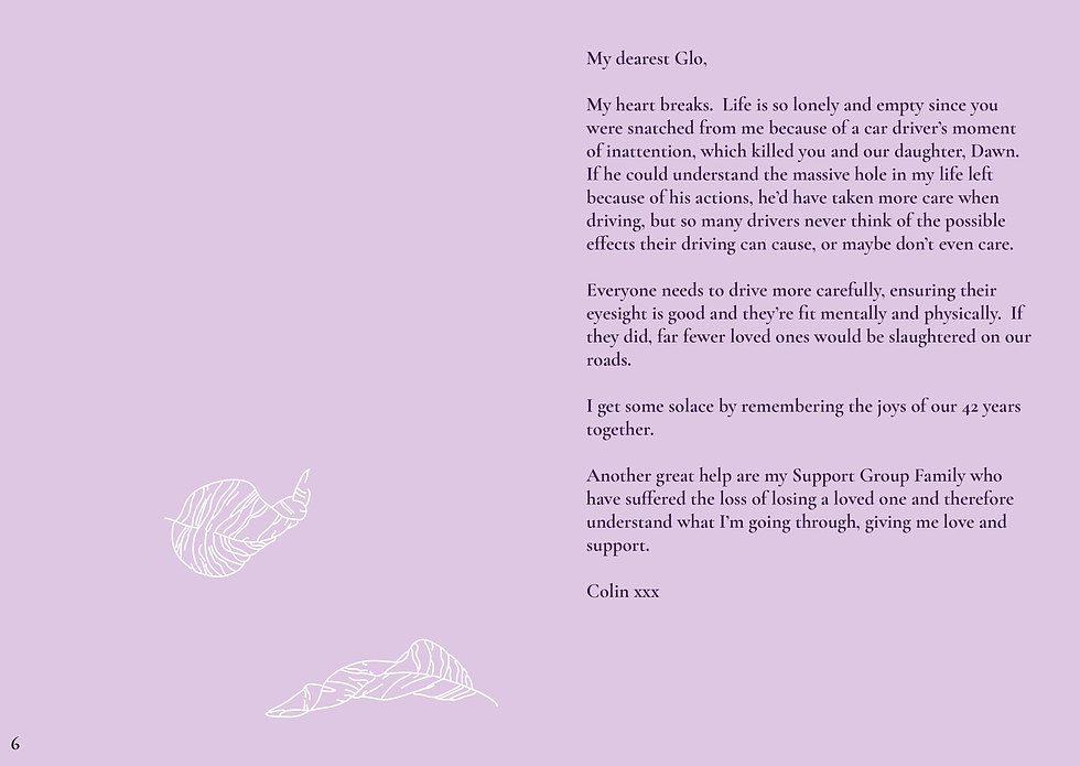

Each letter or poem is placed on individual spreads to recognise each person and their experience. I use negative space throughout to allow space for the writers voice and reader reflection.. The leaf fall illustrations represent the loved ones lost or the letters that the tree holds. They flow throughout, building up towards the centre fold before drifting away towards the end. These guide the reader through, creating an illustrative narrative, for individual interpretation. The type is a soft serif font that is clearly legible and appears light on the page, complimenting the sensitive topic whilst not distracting from tone of voice.
Each letter or poem is placed on individual spreads to recognise each person and their experience. I use negative space throughout to allow space for the writers voice and reader reflection. The leaf fall illustrations represent the loved ones lost or the letters that the tree holds. They flow throughout, building up towards the centre fold before drifting away towards the end. These guide the reader through, creating an illustrative narrative, for individual interpretation. The type is a soft serif font that is clearly legible and appears light on the page, complimenting the sensitive topic whilst not distracting from tone of voice.
Each letter or poem is placed on individual spreads to recognise each person and their experience. I use negative space throughout to allow space for the writers voice and reader reflection.. The leaf fall illustrations represent the loved ones lost or the letters that the tree holds. They flow throughout, building up towards the centre fold before drifting away towards the end. These guide the reader through, creating an illustrative narrative, for individual interpretation. The type is a soft serif font that is clearly legible and appears light on the page, complimenting the sensitive topic whilst not distracting from tone of voice.

In the heart of the publication is a pop-up tree mimicking the campaign's Letter Tree installation. As a more personable approach to the design I hand attached each laser cut tree. I used water colour paper, bringing texture to the publication, and providing something tactile for the reader. I also wanted to provide space for the reader to write, draw and leave their own mark.